Sometimes you just need to see it to understand. These graphics and interactive elements distill a complex topic into a digestible tidbit, communicating information like a sidebar would in a magazine to help keep the reader engaged.
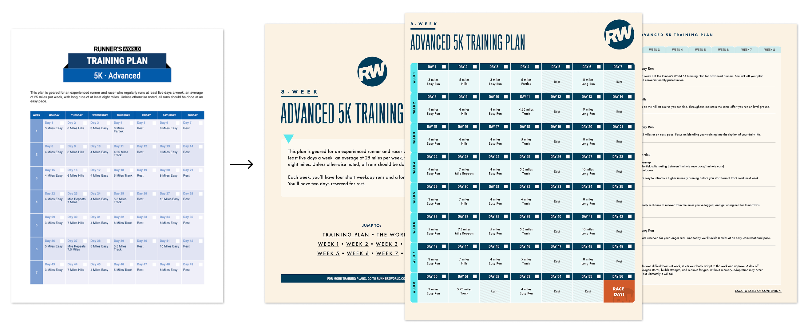
I redesigned the Runner's World training plan PDF template with updated styling and improved navigation within the document, resulting in 50+ new plans for site members.

For a Popular Mechanics feature story on the uptick in catalytic converter theft, I used Illustrator and Photoshop to design a graphic that explains what the car part is made of and how it works.

Using the marketing platform Celtra, I created interactive, responsive iframe elements for a feature story about Eliud Kipchoge. For the story's hero image, you can hover over hotspots to learn more about the world record marathoner. I also adapted an infographic that ran in the print magazine into a swipeable deck of stats.


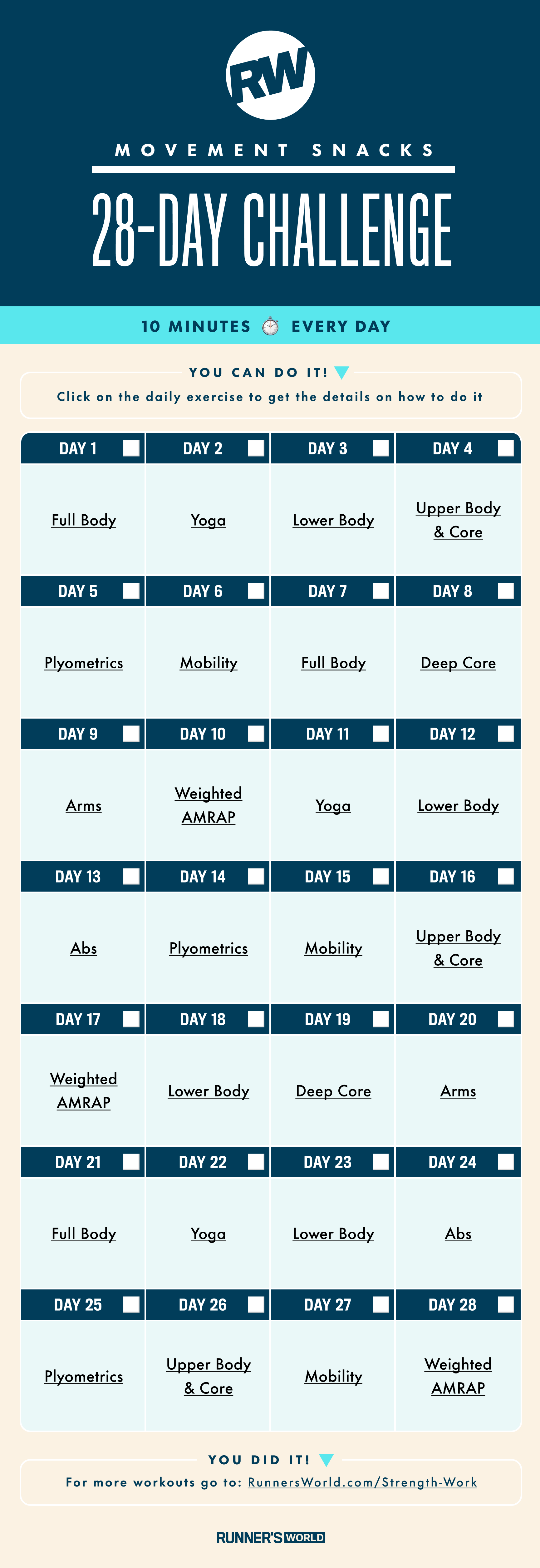
Training strategy and workout guides are helpful visual additions to the service articles on Runner's World. I designed these two in Photoshop and Figma.